Page
Scatterplots
Completion requirements
View
Sometimes you have more than one variable to consider at one time. For example, a big company has to decide whether they really get more income if they spend more on advertising. They are trying to compare two variables. We say the data are bivariate.
To see whether income does increase with increased cost of advertising, the company would collect as many data as possible regarding both variables. They would pair the values and write them as (x;y) ordered pairs. They would then plot all these points on a graph. The horizontal axis is the explanatory variable X and the vertical axis is the response variable Y. The result will be scattered points all over the graph. This is known as a scatter plot. Below is an example of a scatter plot.
The purpose of collecting bivariate observations is to answer such questions as:
- Are the variables related?
- If so, does an increase in one variable cause an increase or decrease in the other variable?
- What is the nature of the relationship indicated by the data?
- Can we quantify the strength of the relation?
- Can we make predictions?
Studying the x measurements by themselves or the y measurements by themselves would not help us answer these questions.
The scatterplot provides a visual impression of the relation between the X and Y variables. If the points cluster along a line, a linear relation is indicated. Points that band around a curve indicate a curvilinear relation. If the points form a pattern-less cluster, no relation among the variables is indicated.
Example: Constructing and interpreting a scatterplot
Total revenue (millions of Rands) and operating income (millions of Rands) for the n = 26 teams in the Provincial Rugby League for the 2003 – 2004 season can be determined from the data given in the table below. Suppose we believe that total revenue determines or explains, to a large extent, operating income. Plot these pairs of observations as a scatterplot.
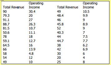
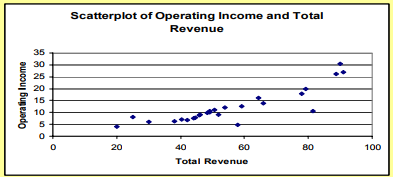
Solution and Discussion: The scatterplot of total revenue and operating income for the Rugby League teams is shown in the figure above. Total revenue is the explanatory variable (X variable), and operating income as the response (Y variable). The points in the scatterplot look as though they lie along a straight line. Low revenue is paired with low operating income. This is what we would expect. When this happens, we say there is a positive association or positive relation between the two variables.
In addition to providing a graphical description of the association between two variables, scatterplots often reveal information that is not evident from looking at the numbers themselves. The next example illustrates this point.
Example: Scatterplot illustrating a linear relation with increasing variation. The following table contains estimated and actual costs (millions of Rands) for 26 construction projects. Plot the bivariate construction cost data as a scatterplot.

Solution and Discussion: Let the explanatory variable, X, be estimated cost and the response variable, Y, be actual cost. The (x, y) values are graphed as a scatterplot in the figure below, with the horizontal axis representing estimated cost and the vertical axis representing actual cost.
Example: The first point to be plotted is (x1, y1) = (.575, .918).
Again, the southwest to northeast pattern of the points indicates a positive association between estimated cost and actual cost; that is, (relatively) high estimated costs tend to occur with (relatively) high actual costs, and (relatively) low estimated costs with (relatively) low actual costs.
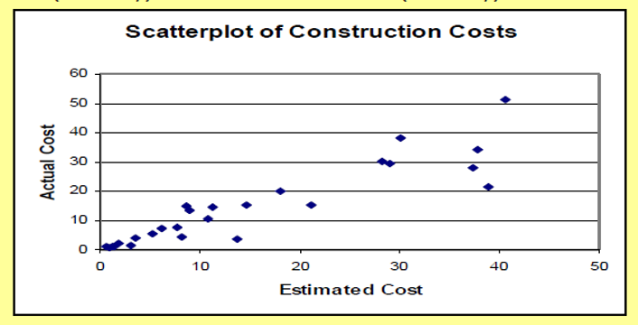
If the engineers could explain (predict) construction costs with no error, the estimated cost would equal the actual cost for each project and all the points would lie along the diagonal line through the origin. Notice that the points in the scatterplot "fan out" as the values increase. The points corresponding to small projects are closer together than the points corresponding to big (expensive) projects. The deviation (difference) of actual cost from estimated cost appears to increase with the size of the project. The engineers typically come close to determining the costs of smaller projects. They are less successful with the larger ones.
The Correlation Coefficient – a Measure of Linear Relation
The scatterplot gives a visual impression of the relation between the x and y values in a bivariate data set. In many cases, the points appear to cluster around a straight line.
A numerical measure of the closeness of the scatter to a straight line is provided by the sample correlation coefficient.
The sample correlation coefficient, denoted by r, is a measure of the strength of the linear relation between the X and Y variables. The manner in which the correlation coefficient assesses the strength of the linear relation is summarized as follows:
- The value of r is always between -1 and +1.
- The magnitude of r indicates the strength of the linear relation, and its sign indicates the direction. In particular,
- r > 0 if the pattern of (x,y) values is a band that runs from lower left to upper right
- r < 0 if the pattern of (x,y) values is a band that runs from upper left to lower right
- r = +1 if all (x,y) values lie exactly on a straight line with a positive slope (perfect positive linear relation)
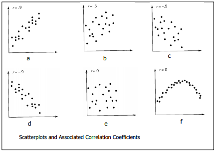
- r = -1 if all (x,y) values lie exactly on a straight line with a negative slope (perfect negative linear relation) A value of r close to -1 or +1 represents a strong linear relation. A value of r close to 0 means that the linear relation is very weak. It is a good idea to interpret r in conjunction with a scatterplot of the bivariate data. If there is no visible relation, that is, if the y values do not change in any direction as the x values change, then r will be close to 0. Also, a value of r near 0 can occur if the scatterplot points band around a curve that is far from linear. These situations, and others, are illustrated in the figure below. Keep in mind that the correlation coefficient is a measure of a linear or straight-line relation. A value of r close to 0 indicates the absence of a linear relation, but it does not necessarily mean that there is no relationship.
The figure below illustrates the correspondence between scatter diagram patterns and the value of r. Notice that (e) and (f) correspond to situations where r = 0. The zero correlation in (e) is due to an absence of any relation between X and Y. The zero zero correlation in (f) is due to a relation that is quite strong but far from linear.