Page
The Data Collection Plan
Completion requirements
View
Certain steps help to ensure data quality. Collecting data properly, particularly data collected as part of a survey, is often an intricate process. Data collection requires careful reflection on the complexities involved in a population structure, the practical feasibility of sampling methods, the coordination and supervision of field work, and finally the processing, analyses, and reporting of the data. We briefly introduce these issues by examining the principal steps involved in the collection of primary data.
Step 1: Determine the Purpose of the Study
To have a clear goal of the investigation we need to decide on the following:
- What do we hope to learn from the data?
- How are we going to collect the data?
- By defining the purpose of the study as specifically as possible before we even start ensures that we are unlikely to overlook vital information.
Step 2: Determine the Data to be Collected
It is important that the farmer should be able to identify the data relevant to satisfy his/her objective. By identifying the all relevant data required the farmer can assure that his purpose of met.
Click here to download a handout that explains an example of data to be kept for a broiler.
Step 3: Determine the Plan for Collecting the Data
The method used for collecting data depends on the money and equipment available, and also on the purpose of the investigation. You must choose a sample design and a sample size.
The choice of the sampling design is based on such factors as the structure of the population, the type of information sought, and the administrative facilities and personnel available to carry out the plan. In conjunction with choosing the appropriate data collection method, we determine the required sample size by specifying the degree of precision desired in the sample summary measure. Data collection costs money, thus you must choose a sample procedure that you can afford.
The data collection plan would depend on the type of data you would wish to collect. The type of data could be any aspect of agriculture like, pest numbers, plant numbers, soil analyses data, weather data, poultry data, control of stock etc. Steps to compile a data collection plan:
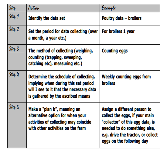
Example: Farmer Rose would select two small plots close to each other to conduct his fertiliser trial. He would need to repeat the experiment a few times in order to collect sufficient data for analysis. Perhaps he could select six plots of 1 m2 each, so that he could conduct the trial three times at the same time. Farmer Brown, on the other hand, could select 30 cattle that are similar in size for each treatment. In this way he could get a reasonably good idea which dip works best without spending huge amounts of money and time.
Requirement: The data collection plan should be in writing and visually presented in order for it to be easily understandable and accessible for the person who are responsible for the collection of data, and for the person who are conducting the planning to be at hand for revising and implementation
Step 4: Train Personnel
Training is often needed for the people responsible for actually recording the observations and organizing them in files. Training may take several forms and may be ongoing if the data collection takes place over an extended period of time.
Everyone should understand the importance of the data so that data collection is taken seriously. Why are the data being collected? What difference does it make to the organization? What happens if the data contain errors?
Step 5: Implement a Data Collection Plan
Schedule the Time of Collection of the Data
The time of collection of the data should be scheduled to suit the specific type of data which is collected. For insects, the time of collection by means of sweeping would for example be early morning before the insects are agile and fly around, and it should be scheduled on a constant basis, e.g. sweeping early mornings, once a week for 6 weeks.
A person doing this unit standard should be able to supervise the collection of the data and see that it is done at specific times. Depending on the site or set-up where data is collected, a mechanism can be put in place to check of data is collected according to the scheduled times. A logbook can be completed, a check-in –checkout system can be installed, or the person collecting the date can be merely trusted and asked to deliver the data sheet on time, or it can be checked on completion at the appropriate time.
Example: In the example of broilers (used above), a broiler recording sheet is designed to:
- Mark the date each time you start a new bag of feed
- Mark every time a bird dies or is culled (removed due to sickness)
- Complete the recording sheet every day and deliver to the supervisor
Supervise the Collection of the Data According to Plan
A person doing this unit standard should be able to instruct and advise on the collation of a data sheet, in order to deliver the most relevant data. The person completing this Specific Outcome should be able to instruct and advice on the collation of data for a specific purpose, and the explanation should be given clearly.
Example: In the broiler example, the farmers have to determine the % mortality as part of his data set to determine his annual income.
He calculates the mortality by not only recording each day’s death or sickness, but also combining these numbers to do a calculation.
He was advised to calculate the mortality by dividing the total number of broilers at the start of the programme.
Then he should divide the number of deaths over the period by the number of boilers at the start. (For 200 broilers, 24 deaths / 200 broilers = 0.12).
Mortality is expressed as a %, so he multiplies this figure by 100. (0.12 x 100 = 12%).
He then reports on the percentage mortality.
Identify Gaps and Irregularities in Data Collection
Data may often be suggestive and not provide the information, which was required, if not all factors that can have an influence on the issue are taken into account. One of the common problems is where there is are gaps in data. The data set obtained should provide sensible logical information within the context it was gathered or collected. The data should be gathered while taking note of the specific environmental conditions, functioning state of the apparatus used, timeframe given, and the socio-economic context of the people involved.
There are various different methods filling gaps in data and there is no right or wrong method of filling gaps, as it is always a compromise. Unfortunately, there is no right or wrong method of filling gaps, as it is always a compromise. The method you choose is dictated by the quality of the data you require versus the effect to attain it and the importance of the impact that the choice of the method makes to your results.The following methods are just some of the ways you could fill the gaps in data:
- Carry values forward. Meaning you’re taking the previous value and bringing it forward to fill the gap.
- You could use data that was received at the same time. Data from a day, week or year before, and use that to fill the gap.
- Taking averages of points in previous years for the same point. Or doing more with season + day type averages. Each day has an associated day type (weekend + weekday for a simple example) and season of the year. This allows averages to be built that are more reflective of seasonal variations and usage and are less prone to suffering from the impact of more extreme individual values
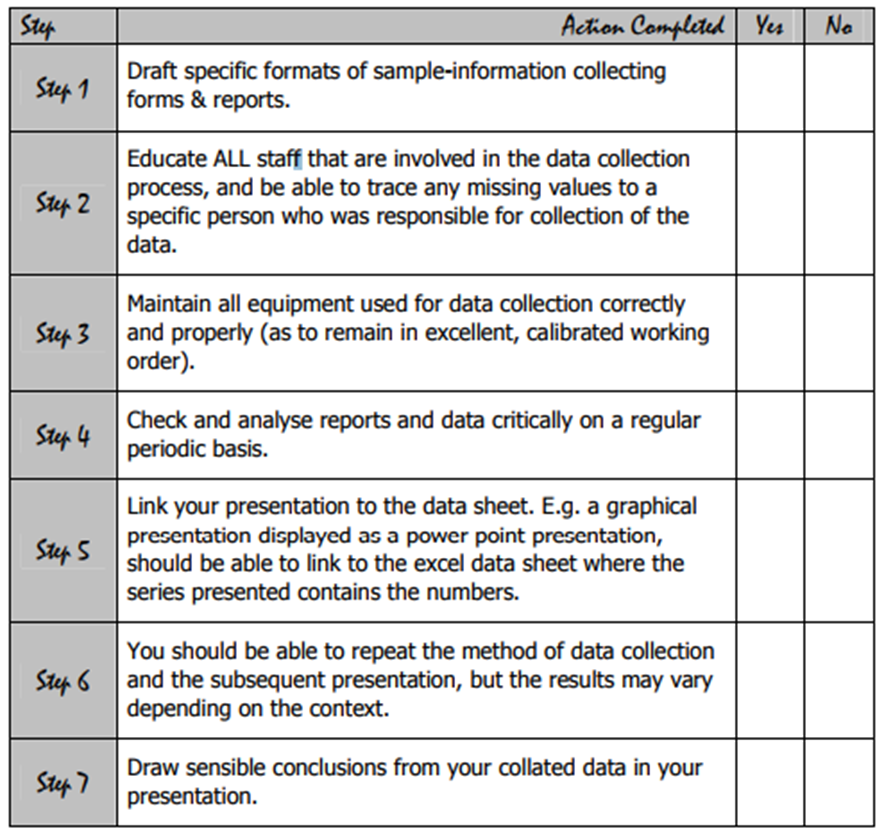
Step 6: Collate Data
By this time, the data collected should be collated – grouped and interpreted and the relevant numbers should be compiled in the form of a report or in some other format and be ready for interpretation and analysis of the data.
There are different formats in which data can be collated, including:
- Written format: Graphical presentation; recording sheets or logbooks; tabulate)
- Electronic format on a computer system
- As an oral presentation
- Visual presentation
One should ask if the reporting format selected in a usable for others. One should also consider whether data that is reported on could be referred to at a later stage.
Data reported on should include additional comments or an opportunity to identify inconsistencies in the data sheet or alternative results that occurred as expected.
Tools used in the data collection process should be identified as being impaired or non-functional (electronic tools) and reported on as such.
Data Organisation and Presentation
There are many ways of presenting data. No one style is appropriate for all types of data. You should select the style so that the observer will be able to understand the features of the data that you want to illuminate. Here are a few types of data presentation styles:
Tables: Lists of numerical quantities. If the data set is "small" just listing the data can be done. As the data set becomes larger this is not a good technique. Remember that people can only look at a very small set of number without "turning-off".

Pictograms: The simplest way of visually representing data is to use pictograms. Pictures are used to compare quantities. This can have the look as a bar graph as well as add some interest to the viewer. Pictograms were dealt with in great detail in earlier modules and you are invited to refer back to work from previous years.
Pie Charts: Used to illustrate proportions of the total amount. The size of each slice shows how much of the total the slice represents. This type of graph is seen quite often in economics. The disadvantage is that the viewer has no idea how big the actual sample size was.
Bar Graphs: (Bar Charts). The length of a bar represents the quantity that is under comparison. There are many types of bar charts, but they all should try to have a uniform width, spacing, and a zero value. Remember that bar charts have gaps between them. (Learning tip: bar graph has a gap in its name!). Bar graphs are used when there is no continuity between data groups. For example: if you are comparing the sales if a number of different types of bakkies you will use a bar graph. There is no continuity between a Nissan bakkie and a Toyota bakkie.

Histogram: A histogram has no spaces between the bars. It is used when there is continuity between the categories selected. A histogram is also used in showing frequency distributions.

Time Plot (Time Series): Graphs used to illustrate some characteristic over time. These, and regression plots study two random variables simultaneously. There are many examples of this in economics, e.g. Daily share prices.
- Graphs must be clearly labelled so as to avoid any ambiguity as to what information is being conveyed.
- The reader must also be informed of the source of the presentation so that the data may be authenticated if necessary.
- The ultimate choice of presentation depends on the data type:
- For qualitative data (nominal and ordinal) use tables, pie and bar charts.
- For quantitative data (interval and ratio) use histograms or line graphs.
The latter is useful for looking at trends over time. Graphs can be powerful tools to convey information but can also be confusing to understand. Try to keep them simple and use the type of graph which best illustrates information about the data and its characteristics.
Click here to download a handout that explains the types of Agri data to be collected and how it is collated.
Step 7: Data Analysis
Lets consider an example:
Example of Data Analysis and Interpretation

Step 8 Present and Report on Collated Data Coherently
When compiling agricultural data and collecting the information that is required, it is important to remember that it is important to choose the methods of data collection carefully in order to make reporting on the data easily understandable and applicable to the objective of data collection. In order to integrate different concepts and conclusions made based on the data set, it is necessary to present the collated data packages together. If it were a series of data gathered at different intervals, the presentation of the data sets in a consistent fashion would demonstrate the tendency in the data series.
Data may be reported as lists of numbers, as summary measures, in graphical form, in tables, or as an equation, or they may simply be described verbally. In general, data should be reported so the information is readily apparent to those who will use it to make decisions. If the appropriate presentation method is unclear, ask the user. Alternatively, imagine yourself as the decision maker. Which methods work for you?
Relevance of Data
It is important that the learner should be able to identify the data relevant to satisfy his/her objective.
The data collected should be collated – grouped and interpreted and the relevant numbers should be considered to satisfy the objective.
Example:
For the control of aphids on cotton, aphids are counted on 3 leaves per plant (bottom, middle and in the upper plant parts) and on 24 plants per field. Aphids in excess of 30 aphids per leaf are considered as highly relevant and as a high infestation. Aphids are therefore not counted as individuals but when more than 30 occurs per leaf surface counted, the plant is considered as being infested. When however, a small number of aphids are present, that is less than 30 in total on three leaves counted, they are considered as having little effect on the plant. When more than 12 plants out of the 24 plants scouted have more than 30 aphids (as a total of 3 leaves) this data is relevant for indicating a possible decision that should be taken to spray for aphids. When fewer than 12 plants with more than 30 aphids is recorded, this data is irrelevant, and one should rely on the natural enemies of aphids to suppress these numbers.
Consider the following points to make sure you understand:
|
Issue |
Explanation |
|
How do I decide when data is rendered relevant? |
It depends on my objective, for what I would like to use the data |
|
What do you do with data not required but recorded? |
Do not discard; since recorded data can many a times explain an occurrence, such as variation in temperatures over time, although, you might require just averages of temperatures. Do not mention the irrelative data in your report but keep on record on a data sheet. |
You need to count and add data correctly in order to collate data. The way in which you handle data will often determine if it is relevant or not. Should averages of data e.g. rainfall be required, it is important to calculate the total correctly divided by the number of days, or months.
For pest data gathered on a specific crop during scouting, it is important to keep track of the number of plants scouted, when determining the threshold for the specific crop. The number of pests observed or recordings of a particular pest made is also important.
Different Methods of Data Presentation and the Selection of the Most Appropriate Method
Different methods of presentation are available depending on the data gathered. Most data sets in agriculture is aimed to be presented at decision makers, be it farmers, researchers, supervisors, politicians, trainers, extension officers etc.
At the farming level, the presentation of a set of data would probably be in a simple manner, and would be in line with the competency of the skills of the person presenting the data set. The presentation of the data is also determined by the extent of detail that is presented in the report, or by the person who are being supervised. Often, it may be that the person presenting the report would also gather the data, write the report and also present the results to his/her supervisor or to the interested parties.
Presenting Data
Simple Ways of presenting data: Transferred verbally with the aid of:
- Flip charts
- Written reports
- Reported with drawings on paper, on blackboards, on pin-up boards.
Advanced Ways of Presenting Data:
- Computer printouts e.g. Weather reports, statistical analyses, data logger reports, report of an instrument that measured a specific parameter, scanning reports etc.
- Computer printouts from data that was typed into the computer system and saved to a file for future reference, e.g.
- Excel spreadsheets.
- Digital presentation by making use of a visual computer programme, such as Powerpoint presentation (Windows Office software).
- DVD or video presentation of a series of data.
- Presentation by electronic media such as email.
Whichever method of presentation is selected, the important issue is communication, be it verbally or in writing.
The Importance Of Presenting Results Accurately And State Findings Clearly
Results or data should be presented accurately, and the findings of the report should be stated clearly.
A person completing this learning outcome should be able to have a good comprehension of how important it is to present data packages accurately. The incorrect presentation of data could lead to incorrect and irrelevant findings made and further be presented as recommendations. The “accuracy” of the data should be correlated with the necessary skill required to provide the data information and to gather the data. Accurate data helps us to make meaningful decisions and to plan effectively in order to maximise our crop yield and crop quality, for maximum profitability and sustainability (i.e. without damaging our environment).
In order for us to report and present data accurately it is important to remember the following points:
Let’s consider an example again:

Click here to download a handout that explains the data collection plan demonstrated.