Most of the books learners are required to read in learnerships are textbooks – books that summarize information about the subject matter of a learnership course. This unit standard emphasizes how to read textbooks because, if you are a full-time learnership learner, you will usually need to read, study, and learn the information in five or more textbooks each term. The first step in reading a textbook is to acquire a quick overview of its contents by surveying it in the way summarized in “How to Preview a Textbook”. A preview provides you with an overview of a book and helps you to orient yourself for reading and studying it.
Before you read a textbook, examine the features in the front and back of the book.
Preview the Front of the Book
- Read the title page to learn the title, author (or authors), and publisher of the book.
- Read the copyright page to find out what year the book was published.
- Read the table of contents to get an overview of the organization of the book and the major topics discussed in it.
- Read the preface or introduction to find out whether it describes special features that are provided in the book to help learners learn.
Preview the Back of the Book
- Determine whether an appendix follows the last chapter; if it is, find out what is in the appendix.
- Check to see if there is a glossary at the end of the book or if there are short glossaries in each chapter.
- Determine whether references are listed at the end of the book or at the end of each chapter.
- Determine whether there is an index at the end of the book or if the book has a subject index and a name index.
The Title Page
Begin a preview by reading the title page. It gives exact information about the title of a book, the author or authors, the publisher, and the city in which the book was published. The title page is usually the second or third page in a book. When the title of a book is not followed by an edition number, it is the first edition and when more than one city is listed on a title page; the book was published in the first city listed.
The Copyright Page
After you have read the title page, read the page that follows it-the copyright page. A copyright page tells when a book was published. When more than one year is listed in the copyright information, the book was published in the most recent year listed. The copyright year tells you whether the information in a book is sufficiently up-to-date for your purposes. For instance, if you want to learn about the current tax laws of the United States, you will want to read a book with a very recent copyright date. On the other hand, if you want to learn how to give a speech, a book published ten years ago may give information that is sufficiently up to date for this purpose.
Table of Contents
Continue your preview by reading the table of contents, which provides an overview of the organization of a book and the major topics discussed in it. When a table of contents does not follow the copyright page, look for it, following the preface or introduction.
The Preface/Foreword or Introduction
A preface/foreword or an introduction explains why a book was written; it usually presents information about the purpose, philosophy, or contents of a book, and it often describes special features that are provided to help learners learn information in the book. These opening remarks are usually located on pages following the table of contents, but sometimes they appear before the table of contents. Most books have either a preface or a foreword or an introduction; some books have both.
The Appendix
An appendix, which contains supplementary material, is usually located immediately after the last chapter. An appendix in a chemistry textbook may present an overview of the mathematics important to know in chemistry, and an appendix in an English textbook may explain how to punctuate and capitalize when writing. However, many textbooks have no appendix.
The Glossary
A glossary is an alphabetically arranged list of important words and their definitions. When a glossary is included in a book, it is usually located after the last chapter or after the appendix. A textbook that has no glossary at the end may have short glossaries at the end of each chapter.
The References
The references, a bibliography, or notes are lists of publications and other sources that an author quotes or refers to in a book. References are usually listed at the end of a textbook, following the glossary or last chapter. When they are not at the end of a book, they may be listed at the end of each chapter. Textbooks for subjects such as English, speech, and mathematics usually have no references.
The Index
An index is an alphabetically arranged list of subjects and the numbers of the pages on which the subjects are discussed in a book. When an index is included in a book, it is on the very last pages. Some books have two indexes: a subject index and a name index, or author index. When a name index (or author index) is included in a book, it is located before the subject index. If you do not find the name of a person in an index, look to see if the book has a name index.
Chapter Preview
One of the most common assignments in learnerships is to read a chapter of a textbook. Most learners undertake this kind of assignment by turning to the first page of a chapter and reading it through to the last page. This is not an efficient way to read and study the chapters in textbooks. Experienced learners know that it is more effective to preview a chapter before reading it. When you preview a chapter, you learn things that make it possible for you to read the chapter with greater understanding. Read “How to Preview a Chapter”.
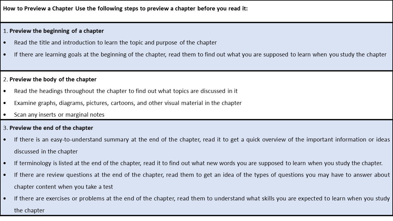
How to preview a chapter use the following steps to preview a chapter before you read it:
Preview the beginning of a chapter.
- Read the title and introduction to learn the topic and purpose of the chapter.
- If there are learning goals at the beginning of the chapter, read them to find out what you are supposed to learn when you study the chapter.
Preview the body of the chapter.
- Read the headings throughout the chapter to find out what topics are discussed in it.
- Examine graphs, diagrams, pictures, cartoons, and other visual material in the chapter.
- Scan any inserts or marginal notes.
Preview the end of the chapter.
- If there is an easy-to-understand summary at the end of the chapter, read it to get a quick overview of the important information or ideas discussed in the chapter.
- If terminology is listed at the end of the chapter, read it to find out what new words you are supposed to learn when you study the chapter.
- If there are review questions at the end of the chapter, read them to get an idea of the types of questions you may have to answer about chapter content when you take a test.
- If there are exercises or problems at the end of the chapter, read them to understand what skills you are expected to learn when you study the chapter.
Title and Introduction
Begin a preview by reading the chapter title and the introduction to the chapter. The title and introduction should summarize what the chapter is about, and an introduction may state the main purpose of the chapter. Whether an introduction to a chapter is short or long, read it carefully as part of your preview.
Headings
Continue a chapter preview by reading the headings to learn what topics are discussed in the chapter. Textbook designers use a variety of methods to show the relationships between headings.
The size of a heading indicates its importance; the larger the heading, the more important it is.
A heading in boldface or a special colour (such as red) is more important than a heading of the same size that is not in boldface or a special colour.
A heading printed above a paragraph is more important than a heading printed on the first line of a paragraph.
The Opening Chapter
The first chapter of a textbook is one of the most important. Here the author sets the stage for what is to follow. At first glance, the first chapter may not seem to say much, and you may be tempted to skip it. Actually, the opening chapter deserves close attention. It presents the framework for the text. More important, it introduces the important terminology used throughout the text. Typically, you can expect to find as many as forty to sixty new words introduced and defined in the first chapter. These words are the language of the course, so to speak. To be successful in any new subject area, it is essential to learn to read and speak its language.
Typographical Aids
Textbooks contain various typographical aids (arrangements or types of print) that make it easy to pick out what is important to learn and remember. These include the following:
- Italic type (slanted print) is often used to call attention to a particular word or phrase. Often new terms are printed in italics in the sentence in which they are defined.
- Enumeration refers to the numbering or lettering of facts and ideas within a paragraph. It is used to emphasize key ideas and to make them easy to locate.
- Headings and subheadings divide the chapters into sections and label the major topic of each section. Basically, they tell in advance what each section will be about. When read in order, the headings and subheadings form a brief outline of the chapter.
- Colour print is used in some texts to emphasize important ideas or definitions.
How Textbook Chapters Are Organised
You can easily feel lost and confused when reading textbook chapters, too. A chapter can seem like a huge, disorganized collection of facts, ideas, numbers, dates, and events to be memorized. Actually, a textbook chapter is, in one respect, much like a large supermarket. It, too, has signs that identify what is located in each section. These signs are the headings that divide the chapter into topics. Underneath each heading, similar ideas are grouped together, just as similar products are grouped together in a supermarket. Sometimes a group of similar or related ideas is labelled by a subheading (usually set in smaller type than the heading and/or indented differently). In most cases, several paragraphs come under one heading.
In this way chapters take a major idea, break it into its important parts, and then break those parts into smaller parts. Notice that this chapter has three major headings and that the first major heading is divided into eight subheadings. Since the chapter is divided into three major headings, you know that it covers three major topics. You can also tell that the first major heading discusses eight types of textbook aids. Of course, the number of major headings, subheadings, and paragraphs under each will vary from chapter to chapter in a book. When you know how a chapter is organized, you can use this knowledge to guide your reading. Once you are familiar with the structure, you will also begin to see how ideas are connected. The chapter will then seem orderly, moving from one idea to the next in a logical fashion.
A General Approach to Graphics
Graphics include tables, charts, graphs, diagrams, photographs, and maps. Here is a general step-by-step approach to reading graphics.
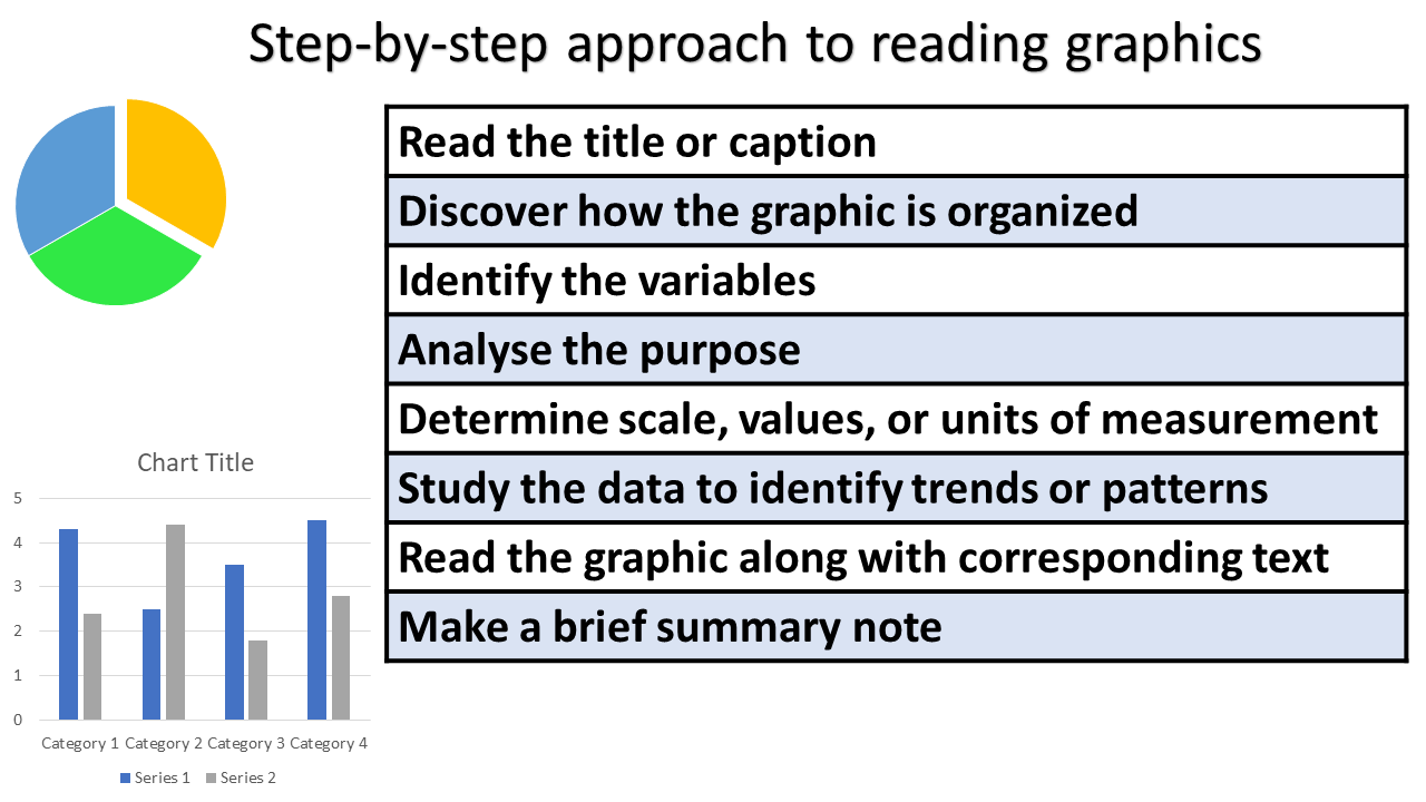
- Read the title or caption. The title will identify the subject and may suggest what relationship is being described.
- Discover how the graphic is organized. Read the column headings or labels on the horizontal and vertical axes.
- Identify the variables. Decide what comparisons are being made or what relationship is being described.
- Analyse the purpose. Based on what you have seen, predict what the graphic is intended to show. Is its purpose to show change over time, describe a process, compare costs, or present statistics?
- Determine scale, values, or units of measurement. The scale is the ratio that a graphic has to the thing it represents. For example, a map may be scaled so that one-inch on the map represents one mile.
- Study the data to identify trends or patterns. Note changes, unusual statistics, unexplained variations.
- Read the graphic along with corresponding text. Refer to the paragraphs that discuss the graphic. These paragraphs may explain certain features of the graphic and identify trends or patterns.
- Make a brief summary note. In the margin, jot a brief note summarizing the trend or pattern the graphic emphasizes. Writing will crystallize the idea in your mind and your note will be useful for reviewing.
Graphic communication is communication using devices such as tables, bar graphs, line graphs, cartoons, pictures and pictograms. These graphic devices often combine numbers, shapes and words. They are sometimes called non-verbal communication. However, this book defines them as graphics and graphic communication because words are often included. The term non-verbal communication should be reserved for the type of communication called body language. Graphic devices are very useful for showing relationships that would take a great deal of writing to explain. They give a quick visual impression and help readers to compare amounts easily. Good visuals have a greater impact than just the written or spoken word on its own. Graphic devices should be properly integrated into a text. Each graphic should be placed into the text where it is needed. It should be introduced, and should then be analysed below, once the reader has had an opportunity to examine it.
The purposes of graphic devices:
Graphic devices help senders to communicate more effectively. They:
- Show groups of numbers that would be very difficult to show in a written message.
- Show relationships that would take many sentences to explain.
- Give a quick visual impression that enables a reader to compare amounts quickly.
These devices include elements that a writer cannot use. These elements include:
- The use of space as in tables.
- The use of shapes, as in bar graphs, illustrations, or pictograms.
- The use of colours to make points stand out.
- The use of lines, as in line graphs and algorithms to show relationships, and stage-by-stage procedures.
- The use of more than one dimension such as length, breadth and even depth.
Graphic devices have the great advantage that the audience can see all the components and relationships at once. In a written message, on the other hand, the reader has to follow the information in a fixed sequence. Good visuals have a greater impact than just the spoken or written word. A combination of the spoken and visual can be up to twice as powerful as the spoken message on its own. In the same way graphic devices add visual appeal to a written message. They also help to explain difficult ideas, show relationships, simplify and summarize.
Hyperlinks
Hyperlinks (often just called links) are the connections between Web pages. Links are the heart of the World Wide Web. Clicking a link takes you from the page you are viewing to another page, or perhaps to an image. Links can also be used to play sounds, movies, or to let you download a file. They are usually text, and are normally displayed as blue, underlined words. The colour of a link changes to purple once you have visited it. This colour change helps you keep track of which links you have and haven’t been to.
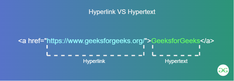
However, as you surf the Web, you will doubtless run across many variations on the standard approach. Among the most common are image links and image maps. Images are any graphic, ranging from photographs to drawings. Regular images just appear, unadorned, on the Web page you are viewing. Image links, though, are outlined in a blue rectangle, thus helping you recognize them as such. With both text and image links, you simply click the link to go to a new page. Image maps are not outlined in blue, but are usually recognizable due to the fact that they are composed of a variety of separate images grouped together, with each different image holding an obvious meaning. Many image maps are actual geographical maps, just like you would see in an atlas. You may, for instance, run across an image map of South Africa.
Clicking one of the provinces might take you to information about a company’s offices and plants in that province. If you wonder if an image is an image map or not, just run your mouse across it and observe the changes in the status line of your browser. If it is an image map, different Web addresses appear in the status line as you move the mouse pointer across the image map. It is possible for Web designers to create links that do not look like the normal ones, and you will often find these on Web sites that use a magazine style for their layout, like the one in the figure on the bottom right. A basic rule is, if it looks like a table of contents, it’s a set of links. To be certain, just move your pointer over a suspected link and see if a Web address appears in your status line.