Promoting Learner Understanding Through Structuring Content Via Visualisation Methodologies
Click here to view an explanation about promoting learner understanding.
Click here to view a video that explains the importance of visual communication.
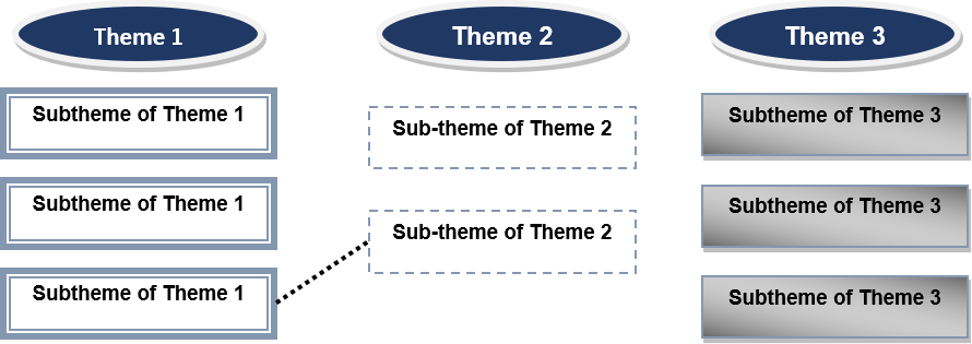
Thematic Dimensioning
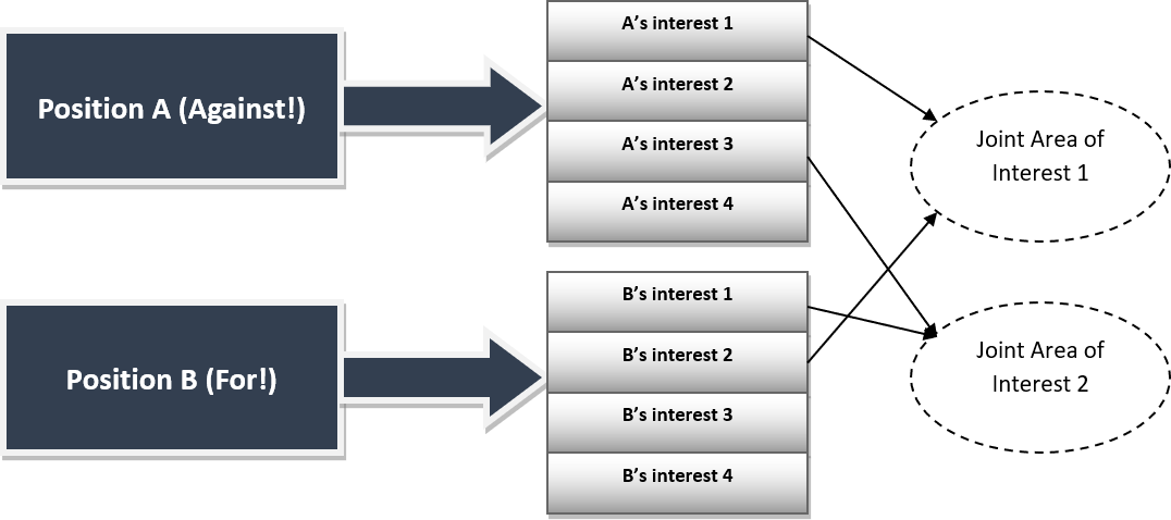
Consensus Building for Contrary Positions
Pro/Contra
Accentuate the boundary between the arguments for and against a solution visually (thick line between the arguments, red and green cards/ink) and, i.e. within the context of a formal debate, through seating the learners opposite each other.
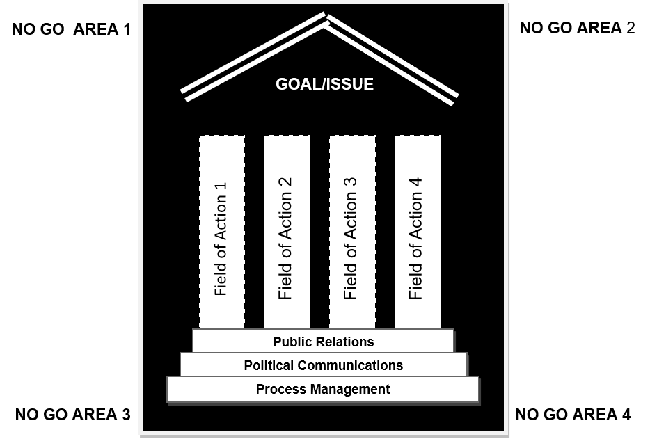
Hierarchical and Systemic Structure for Action Fields
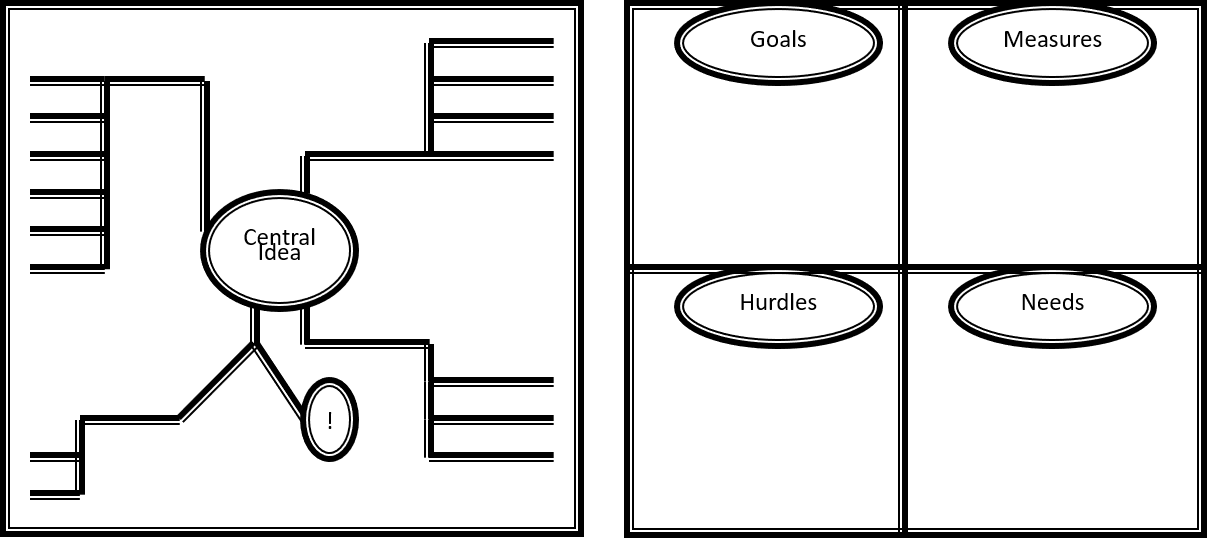
Associative Thought Structuring (i.e. for Break-Away Groups)
Workshop Hand-Outs
Written material supports knowledge dissemination and reduces redundant repetition. It can provide background information and/or details which would take too long time to be introduced during the workshop sessions. It is important to gain the attention of the learners for the entire workshop. Don’t make them have to write every task and every piece of information simultaneously to actively taking part. Provide them with the background information, with copies of any input and maybe with the minutes of previous meetings so they don’t have to stall the process or redo covered ground.
In large conferences, provide your learners with their own copy of the targets and the agenda. They should also be able to orient their way around the building, so a decent map of the location should also be tucked away in their folder. Give them important information, such as telephone numbers of taxis and organisers as well as things to do any free time. A list of learners is also exciting for the learners to read, so they know who is there. Don’t forget to allow sponsors to print their logos on the folders – this could be an added incentive to sponsor your conference.
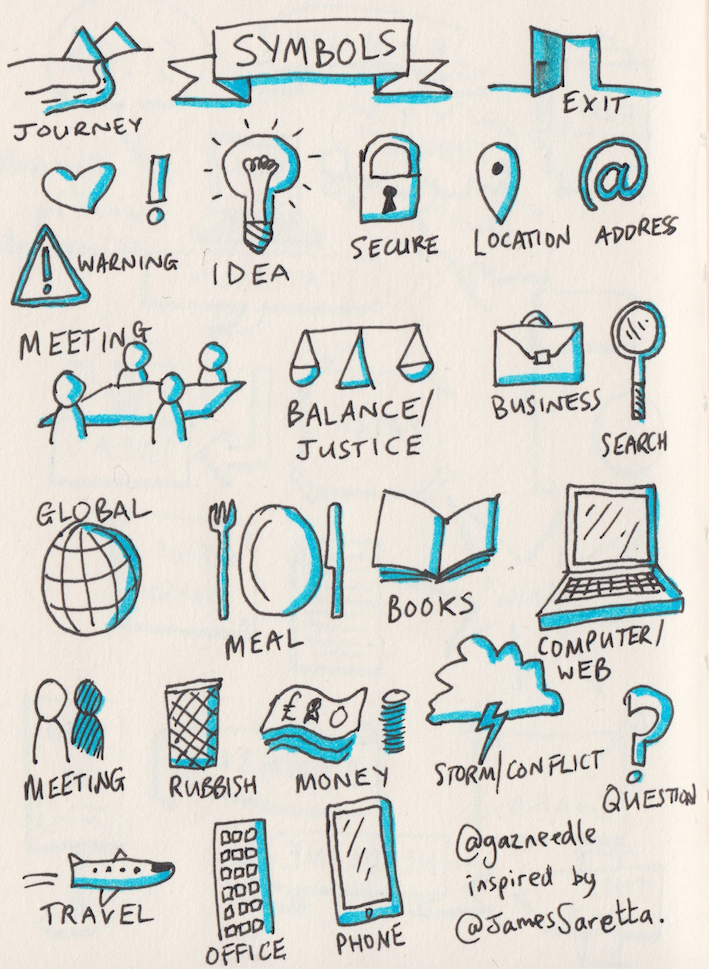
Using Symbols
Symbols could be used as a communication tool during the facilitated workshop. A good mixture of words and symbols will draw each participant through a complex and highly individual process of (re-)cognition, association and emotional reaction towards the issue and motivate him/her to actively participate. Due to the emotional reactions often caused by symbols, it is wise to test the effects on different people before using them for a mixed audience: you may be wanting to trigger associations of peace and tranquillity with your Caspar David Friedrich landscape, but in fact you frustrate those learners wanting a clear image of “what’s on the map”.
Examples of Using Symbols:
- Welcome poster: this confirms that a participant is at the right venue and is warmly welcome e.g. in the form of an open door.
- Use of pictures/drawings to enable learners to talk about something which they would otherwise be uncomfortable to talk about because it is a taboo, sensitive or personal, for example in a conflict situation: painting of a simple picture of the conflict by one party and the other party interprets and vice-versa.
- Symbols to illustrate something which otherwise would have taken a lot of time and words to explain, as for example:
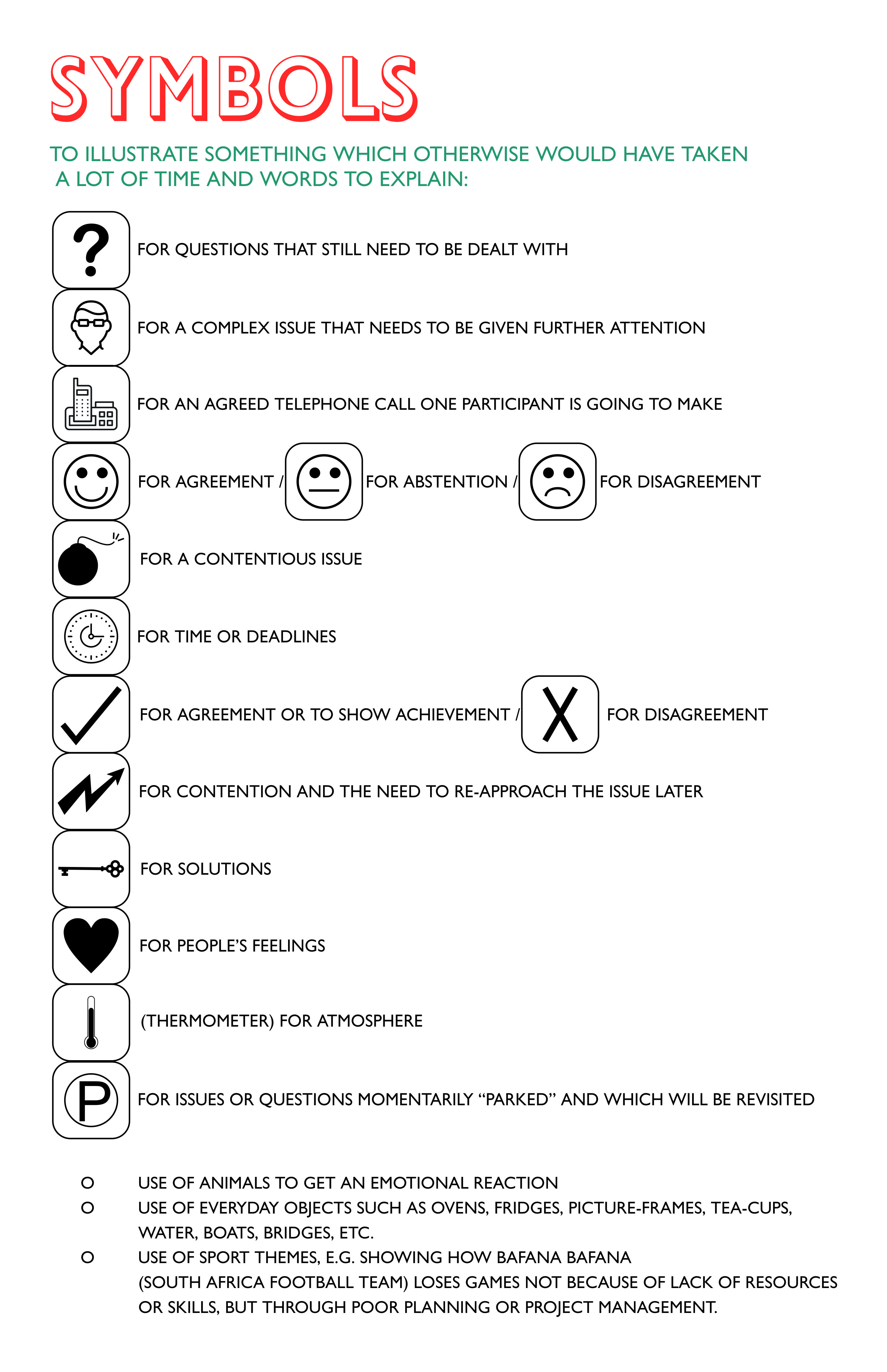
Beware of the actual symbol you use, as different learner might have different understanding of the symbols used, and some symbols might be considered offensive.
The answer is to think carefully and then to explain your intended meaning during the introduction phase.
