Page
The Use Of Visual and/or Graphic Representations
Completion requirements
View
Graphics
Graphics is a language in pictures, photographs, symbols and diagrams of different types. Our road signs are a perfect example of how effective graphics can be. Drivers react almost instinctively to, for instance, stop signs and yield signs at intersections. Warning signs for high voltage or workmen overhead are clearly understood by people who are illiterate, together with NO SMOKING signs that are common in public areas.
Graphics such as cartoons, photographs, drawings or illustrations all add clarity and meaning to a subject making sure the reader gains a verbal and pictorial message.
Let’s take a look at some examples:
Pie Charts
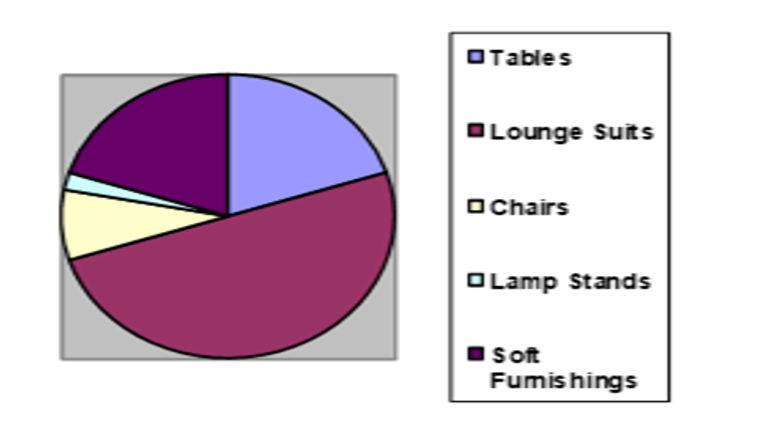
In a pie chart each slice is shown as a percentage of the whole pie. It is used to represent facts. To create a pie chart, first find out the percentage distribution for the series. Sort the percentages in order of size or form from the largest to the smallest clockwise. A pie chart should not have too many slices; otherwise some of them will be too small and will likely be ignored.
For example: The production areas of a large industry are made up of the following: Tables – 20%; Lounge Suites– 50%; Chairs – 8 % and Lamp Stands – 2 %; Soft Furnishings – 20%
Bar Charts
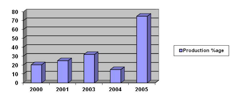
A simple bar chart will show facts in a picture. A bar chart has two or more bars on a common base and is used to point out growth, decline or variation. It may also symbolize the relationship between dependents and independents in a simple form. The dependent variable appears on the vertical axis and the independents on the other axle. The length or height of the bars indicates quantity.
For example: Simple bar chart: Increase in production a large manufacturing facility over a period of five years.
Photographs
Remember the pictures your parents, aunt, uncle or cousins showed of you when you were a baby or toddler. These would tell you about incidents or fun times that the family had when you were too young to remember. Without the photographs, it would be difficult to imagine with just a verbal description. Photographs have the same effect in books, magazines, etc. They enhance the narrative and give the reader a vivid understanding of the writer’s purpose and subject.
Aerial photographs can act as maps. They show you the area surrounding the focal point in the picture. In certain instances, they are used to assess the suitability of the area for building factories or shopping centres.
Mind Maps
Mind maps have a variety of purposes. They are used in problem-solving, idea generating and planning exercises. For instance, if you want to write a report on a production improvement or a process in the office that will improve efficiency, the mind map technique is ideal.
Let’s have a look how it works:
For every exercise you will have a central theme or idea. Draw a circle in the middle of the page and write the idea/theme in the circle.
You can now think of as many ideas as you can to follow that theme/idea. Each of these ideas is written in another circle with a line connecting them to the main idea or theme. For each of these ideas, you may have others that you can link to them.
Have a look at the following example:
We are going to write a children’s story. Let’s say our story is about a little boy and his dog.
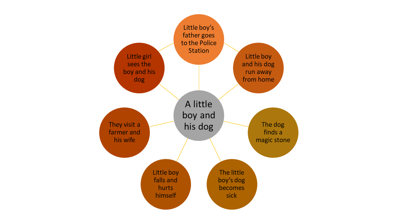
You can see from the mind map all the different ideas that can come from one central theme.
Cartoons
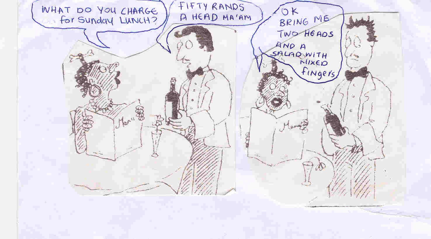
In cartoons, verbal and visual features are combined for a specific purpose. For example, in the cartoon below, the visual features tell you that the setting is a formal restaurant. The focus is placed on formal detail such as the appearance of both the waiter and the customer, and the menu and the flower on the table. The focus is also on facial expressions. The verbal features draw attention to the stupidity of the order.
The visual features are used to create a sense of surprise and disappointment as the waiter’s expression changes, the flower wilts and the wine-cork shoots off inappropriately. The verbal features create a meaning of the unexpected. The techniques used in this cartoon are ambiguity and ridicule.
The audience that this cartoon ridicules are ignorant people. Sometimes the cartoonist will not write any dialogue to support the cartoon. Yet, the meaning will be clear, implying the idea is sometimes more powerful than making a direct statement.
The cartoon below does require dialogue for its meaning. The cartoon on the next page could be just as effective if no dialogue were used.
Maps
Maps can be used to show directions when people are travelling or they can be used it identify locations of the various branches of a company within the country. Their information depends on their purpose.
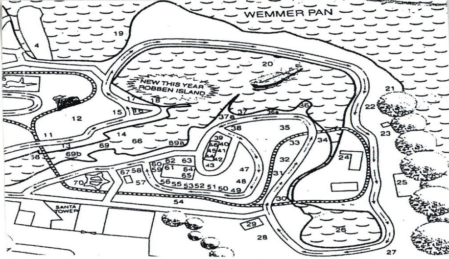
The map below shows a town or village. This could be anywhere, but it shows enough detail for you to identify certain features, for example the railway line that twists and turns through the town. If you are travelling to a city or town that you are not familiar with, you would obviously require more detail.
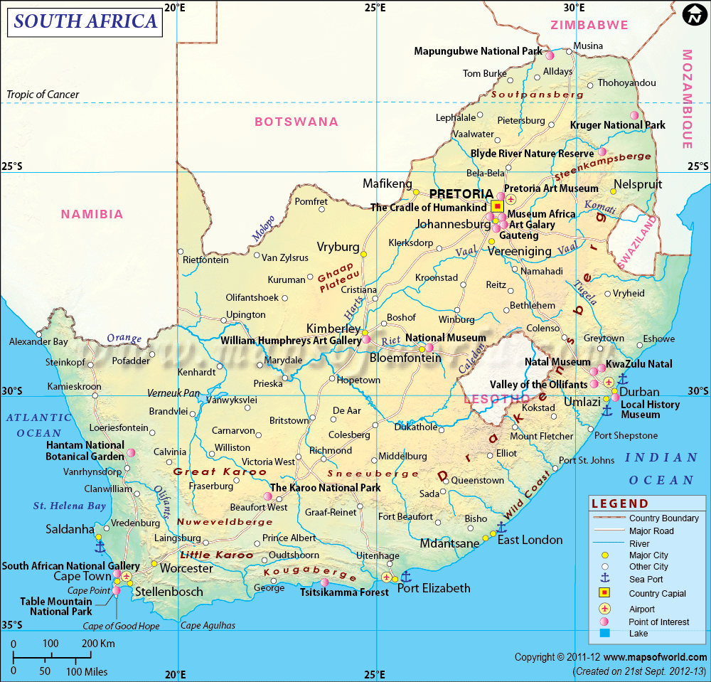
This map of South Africa could be large enough to be hung on a wall in an office that deals with distribution of products. Pointers would be used to show the various depots that the company owns throughout the country.
Schema
A schema is an outline or representation of a plan, a theory or an arrangement (English Oxford Dictionary definition).
Let’s look at an example:
A library a card catalogue schema asks of librarians only to provide enough information about the book to help the library users decide if they want to browse through the book or not and if so, how to find it. Examples of card catalogues include: sorting information by author, by title, keywords, shelf-lists, and so on. Think about when you had to use the library at school, university or college. You wouldn’t walk in and start looking at all the books on the shelves in order to find the one you wanted. Rather you would go to the catalogue card section and search for the book you wanted first and then go find it in the relevant part of the library. Today, this has become computerised. You would sit in front of a computer and type in the author’s name for example and the results you get would tell you where to find the book in the library.
In computer science, a schema is a model e.g. you could have a model of certain computer applications.
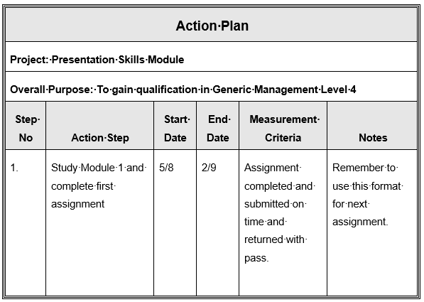
Plans, Diagrams and Maps
Let’s look at plans for studying.
One of the most important steps in studying is the planning. When we start studying we have a goal in mind – we want to gain a qualification; increase our knowledge and maybe even find ourselves a new job.
So, we must draw up an action plan. Here are a few important things to remember when doing your action plan:
- Good Action Plans are time-based.
- Good Action Plans state a clear objective – your qualification.
- Good Action Plans include measurements to track your progress.
- Good Action Plans allow for some flexibility in how their steps are accomplished.
- Good Action Plans hold you responsible for your actions and responsibilities.
Your action plan may look something like the following:
It is important to be aware of the large variety of graphic devices which are used to illustrate written material. The following are some of the basic examples of common graphics used but is by no means complete and by being a little creative, you too can create interesting, informative graphics that will enhance the quality of your work. It is a good idea to keep a file of examples that you could use in the future when you prepare reports, proposals or presentations.
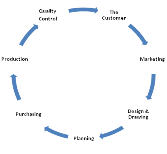 |
The Cycle Diagram is used to show the life cycle or process cycle of a product or system. For instance: The above diagram shows the cycle of production in terms of the customer.
The customer requests a product from the marketing department. The product is then designed to the customer’s specifications which are then sent through to the production planning. Planning would then tell the purchasing department what materials would be needed for the product. The product is then produced. The quality department checks it to ensure it meets the customer’s requirements and it then goes to the customer.
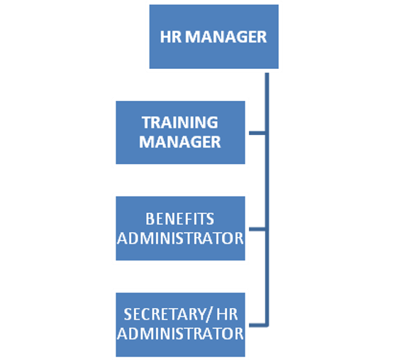
The organisation chart is used to show the structure of an organisation. In the example you can see that the human resources manager would have the following people in the organisation reporting to him/her: