Page
Mathematical Tools to Use in Forecasting
Completion requirements
View
Graphs and Diagrams
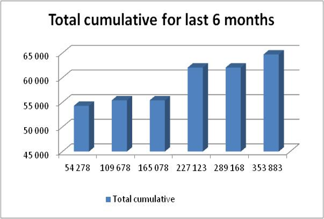
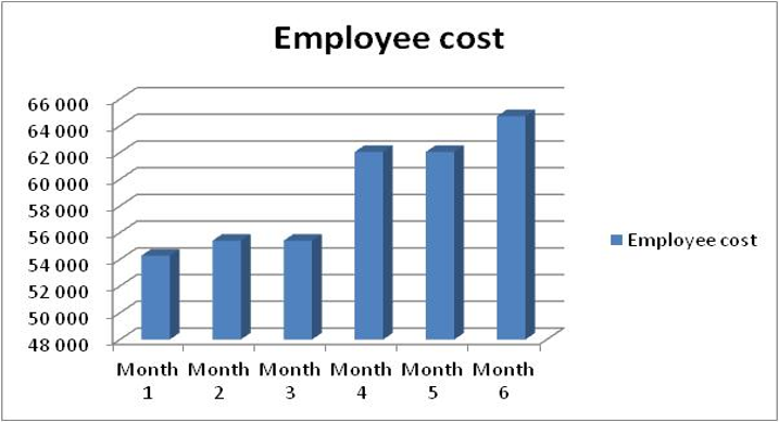
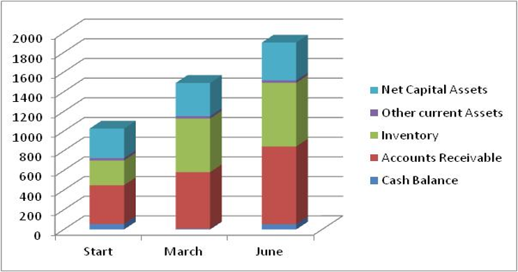
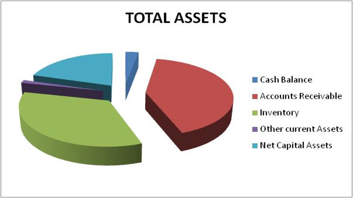
A graph shows the relationship between two variables – the X-variable on the horizontal axis and the Y-variable on the vertical axis. Graphs can be used to complement the data produced on your financial statements, especially for the purposes of a report and presentation. Following are examples of charts from the data in this chapter:
Single Bar Chart (Income Statement)
Stacked Bar Chart (Balance Sheet)
Line Graph (Income Statement)
Pie Charts (Balance Sheet)
Histogram (Income Statement)