Page
Recording Of Climate Data
Completion requirements
View
To appreciate the true risks of farming, farmers need to access long-term climate records. Most farmers have at least one rainfall gauge on their property from which they record daily rainfall. To look at frost risk, farmers need access to reliable, long-term temperature data.
Climate change has had a significant impact on sectors that create employment and sustainable livelihoods, such as agriculture. Human-induced climate change will cause the temperatures to constantly rise. Modern industrial agriculture is one of the biggest contributors to the rapid advance of human-induced climate change. The year 2005 was the warmest year on record, the last eight years were the warmest in the last century and the last century was the warmest in the last 1200 years.
What are the effects of these changes on agriculture?
In the short term:
- Soil loss due to wind, water erosion and soil moisture
- Loss of required cold units essential for fruit and vineyard production
- Erratic rainfall patterns lead to extreme droughts and rainfall events, e.g. storms and floods
- Reduction on quantity and quality of groundwater and the recharge rate
Below, you will find information on techniques that you can use to record the changes in climate and plan your farming practices accordingly.
Techniques To Organize And Represent Data
Data Table
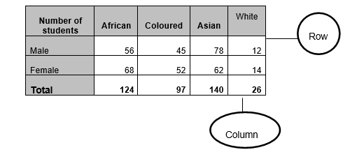
We often have to gather information to establish the trends and reality of situations. Data tables assist us to organize this information logically so that it can be applied to the purpose it was intended for. Data tables are similar to a register or record of events or items that give us information and the information is given to use in rows and columns. A row is any horizontal collection of data while a column is any vertical collection of data.
Example:
Interpretation of Data
The interpretation of data is very simple if you are able to work through it systematically. The most important features of data are:
- Frequency
- Average
- Modus
- Median
- Range
Frequency
Frequency is the number of times a certain value appears in a series of data.
Example: In the series of data below, the number 5 appears 6 times, therefore the frequency of 5 is 6. It is the value that appears most often in the series:
3; 5; 3; 7; 5; 6; 5; 9; 5; 2; 4; 4; 5; 5; 8
Average
Adding together all the values and then dividing them by the number of items calculate the average of a set of data. The average is also known as the mean.
Example:
We will use our previous set of data: 3; 5; 3; 7; 5; 6; 5; 9; 5; 2; 4; 4; 5; 5; 8
To calculate the average, we first add together all the values:
3 + 5 + 3 + 7 + 5 + 6 + 5 + 9 + 5 + 2 + 4 + 4 + 5 + 5 + 8 = 126
Then we count how many items are there, i.e. 15
Mode
The mode is the number that occurs most frequently in the series of data. In the series of data below, the mode is 5.
3; 5; 3; 7; 5; 6; 5; 9; 5; 2; 4; 4; 5; 5; 8
Median
The median in a series of data is the number that is exactly in the middle or halfway between two numbers in the middle.
Range
The range is the difference between the highest number and the lowest number in a set of data.
The range in the set of data we have been using as an example will be as follows: 2; 3; 3; 4; 4; 5; 5; 5; 5; 5; 5; 6; 7; 8; 9
Range = Highest Number – Lowest Number
= 9 – 2
= 7
Graphs
Graphs are visual representations of what is written in a data table. There are many types of graphs that we can use, and it usually depends on what you need to represent and to whom the representation is made.
Examples:
|
Bar Graph Bar graphs are used when the data classes are not continuous e.g. in comparing the annual yield of carrots, tomatoes and potatoes of a vegetable farm. There is no intermediate between carrots and tomatoes. The classes are different from each other. |
Histogram Histograms are used if the data classes are continuous. For example, a farmer wants to see how many tons of carrots a certain field produced per year from 2000 to 2006. There are no spaces between the bars because 2000 borders on 2001. Time is continuous. He could also use a line graph. |
 |
 |
|
Pie Chart Pie graphs are graphs that represent the data as segments of a circle. The various data will take up a certain angle of the total angles in a circle (360º). |
Broken Line Graph When we were drawing the bar graph and histogram, we used the whole column to show our data. With a broken line graph, we will only use points, not full columns. |
 |
 |