Page
Mistakes Applying the Principles Of Display
Completion requirements
View
Carefully follow the principles of design used in display work, when planning and executing a display. The four principles most frequently abused include emphasis, balance, rhythm, and proportion. Review these principles each time a display is complete, to be sure none have been misused.
- Every display needs a focal point where the viewer’s eyes can start. All too often, a display has no definite point of emphasis or, the point of emphasis is in the wrong place, such as in the upper right-hand corner.
- Balance needs careful consideration. A display that utilises neither formal nor informal balance by merely being too full or too empty on one or both sides, will decrease the effectiveness of the display.
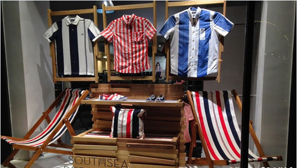
- The principle of rhythm is often violated when many small items are displayed in a single area with no attempt made to keep the eye following a planned pattern. This creates a scattered and spotty display. Try to plan a display in which all items are visually tied together.
- When props and merchandise are not tied together by size or weight, the principle of proportion is absent. Do not show small items with large items unless a continuous graduation of size from small to large is used.
The amount of merchandise on fixtures psychologically affects the shopper. A few fully-stocked fixtures are better than many partially-filled fixtures. When a fixture is sparsely stocked, it looks as if what remain are leftovers, therefore, less desirable, or -saleable.
When considering presentation of merchandise from the front to the back of the store, use consumer psychology.
A stair-step-effect is necessary for the customer to see from the front to the back of the store. Use the lowest fixtures in the front of the store, with the back wall being the highest merchandise area. The basic idea is to make the back wall visible from the aisle or front of the store.
Stocking the back wall is as important as stocking done in the front of the store. The back wall will often be flooded with lights to add even more emphasis to the area. This has the effect of drawing the customer through the whole store. The back wall is best-used to create an impact for the classification of merchandise contained within that area of the store. The walls, whether they are used for hanging, shelving, binning, or a combination of these, are also treated in the light to dark, small to large, left to right manner of merchandising.
Ideally, the back wall should be divided into organised groups or colour patterns to stimulate the customer, to please the viewer’s eyes and alleviate the uniformity which tends to be boring. This can be accomplished by raising or lowering hang-rods, using display shelves, and/or adding bins to the wall area to create more interest.
Click here to view a video on tips how to sell more in your retail business.